Blog Entry — "Site Revamp!" (November 20, 2023)
Back to Blog
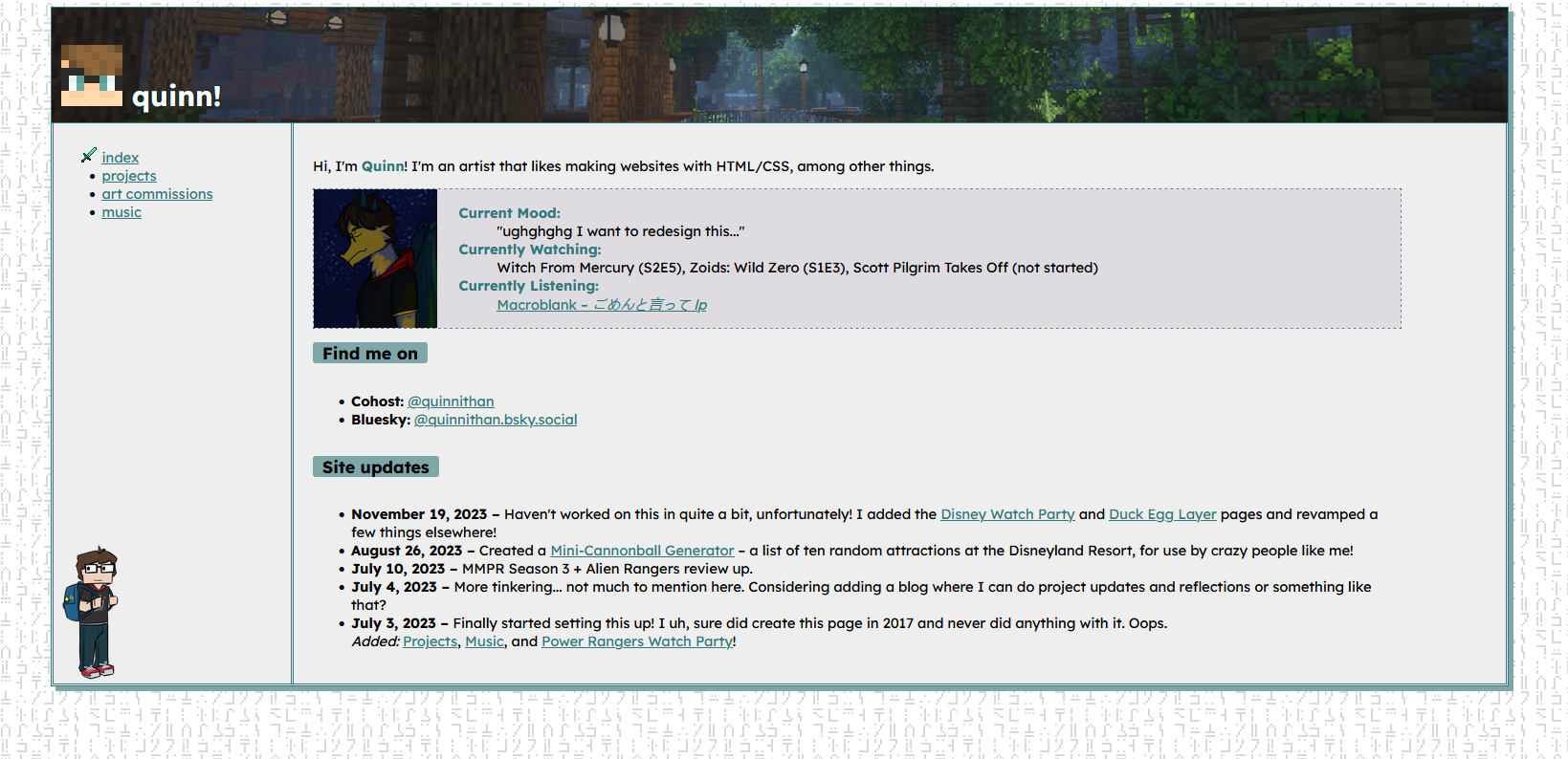
Figured I might document the process of updating my website to its current format here! I felt like the original design was a little boring, so I wanted to spice things up...
This was spurred on as I started teaching my girlfriend the basics of HTML/CSS. I'm really proud of just how quickly she's picked up the basics! I'll probably link to her website on my front page, once it's gotten further along. But anyways, the programming bug bit me again, and I very much obliged to itch at it! I love me some HTML/CSS coding, I'll take any chance I can get to do it.
Initially I flipped the colors around on the original design, just sort of making a dark version of it — and you know what? It didn't look half-bad. But when I decided I wanted to go for a full redesign — after some staring at my site and telling myself, "man, let's just try something new" — something really clicked in me. What especially did this was wanting some color for the background, rather than a plain off-black or off-white. I opened up my Inspect color picker and got something off of my header background, and... yeah. This (#1e2926) is a really nice color.
The color background was a total accident, and came after the main border, actually. I picked up a random blue-green as just an accent, but then messed with the opacity some, and realized, "hey, this looks GREAT, and I've been meaning to play with more colors in my site design practices." From there, a stark white felt too much for the text color, as did a lighter gray; so, I went with a warm off-white, on the yellow spectrum (#d9d6ce), and I think I got a really nice inviting, "pine tree" look going on. Accent color for links was, of course, going to be teal (#1a9b9b). But anybody who knows me well already expected that of me.
The layout took a lot of inspiration of other Neocities pages I've seen; I guess the real instigator here was me wanting to add a User Status part of my page to my original website... since I only had a one-sidebar, main body layout on my old site, the only place I could have put that was on my index; I didn't even have a proper about page! This has been rectified on my new design, which now allows for a second sidebar where I can put all sorts of useless information! Hooray, useless information!
I kept my SGA pattern background, because Commander Keen is a huge part of my childhood; it was basically the first video I ever played, not counting futzing around with the NES my dad briefly owned when I was a baby. That and Quake... making a mental note that I should actually add a Quake button to my collection.
The buttons are new! I guess, in leaning more into the way Neocities pages are usually organized, that I wanted to take part in some of the more fun aspects of having a personal space! The freedom of being able to make your website into however you want it... Ah, that truly is the freedom of Web 1.0. Wonderful.
I even started making my own buttons, which I will be including on my new Freebies page, when I get around to setting that page up!
I'm trying my best to keep the JavaScript useage small on here; the desire to build the whole thing using a JS file for ease of updating is so great, but I forced myself to back down, as it wasn't entirely in the spirit of Neocities. At least updating this site will be less painful than my other big Neocities project...
Anyway! That's enough rambling about all of this. I honestly hate doing this because I feel like I sound self-important with this sort of thing, but damn it, I want a little personal blog, and to do that, you gotta be willing to talk to yourself! Keep checking this space in the future, I'll probably drop more posts here as I go.
— Quinn


